THESIS
Explainable AI for Financial Inclusion
An explainable, fairness-audited credit-scoring framework for the 1.4 billion adults locked out of formal credit.
MSC DATA SCIENCE & BUSINESS INTELLIGENCE · EDC PARIS BUSINESS SCHOOL
1.4 billion adults worldwide lack access to formal credit, not because they can't repay, but because traditional credit scoring requires a bureau history that thin-file and no-file populations don't have. This thesis asks whether machine learning, made explainable via SHAP and audited for fairness, can begin to close that gap without breaking the transparency and robustness requirements the EU AI Act now imposes on high-risk AI systems like credit scoring.
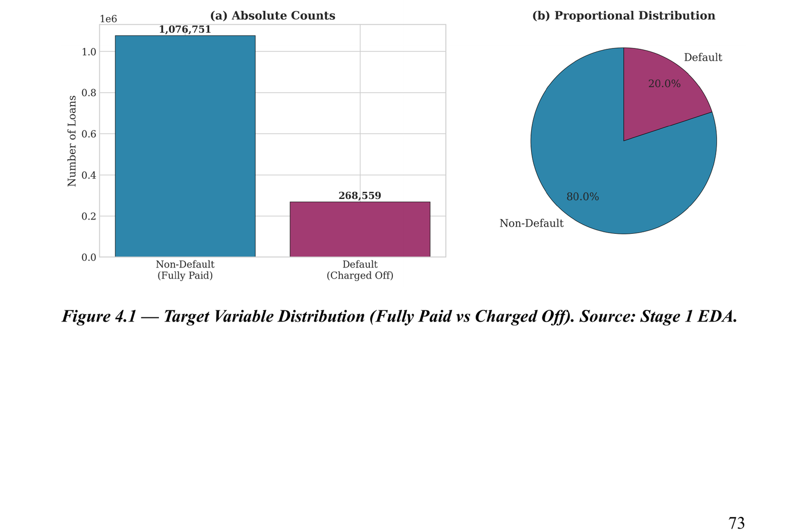
I built and validated the Explainable Inclusive Credit Scoring (EICS) Framework: a three-pillar pipeline (gradient-boosted prediction, SHAP-based explanation, fairness-audited threshold calibration) tested on 1.35 million real Lending Club loan records and replicated on a second, structurally different dataset (Home Credit, 307,511 records) to confirm it wasn't a fluke of one lender's data.
The framework does not claim thin-file populations are direct beneficiaries yet. The datasets available for this thesis, by construction, only include borrowers who already have a bureau credit history, so that claim can't be tested directly here. What the thesis does show is that the framework is built, empirically validated twice, and ready for that deployment as the next step.
The problem
The cause is informational, not behavioural: a young entrepreneur with a viable business but no bureau credit history is invisible to a scoring model trained on bureau data, and so is a salaried worker paid in cash in an informal economy. Two developments made a different approach possible. Gradient-boosted ML models now outperform the logistic regression that has been the credit-scoring industry standard for decades, and explainable-AI techniques like SHAP can decompose a model's predictions into interpretable contributions, removing the black-box objection that has historically kept ML out of regulated lending. The EU AI Act adds the regulatory push: Article 86 gives affected persons a right to a clear, meaningful explanation of an automated credit decision.
What I built: the EICS Framework
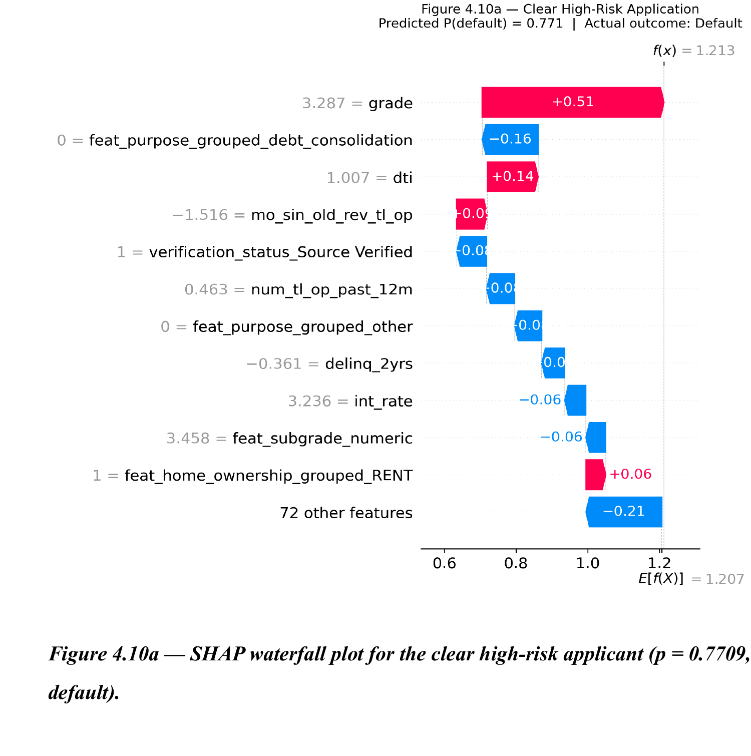
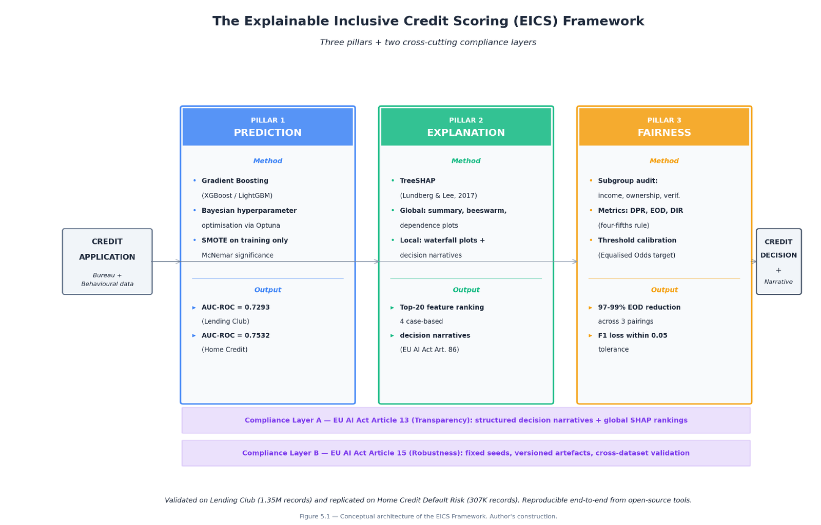
Three pillars, plus two compliance layers. Prediction: a gradient-boosting classifier (XGBoost or LightGBM, empirically interchangeable) trained on a SMOTE-balanced sample with Bayesian hyperparameter search. Explanation: TreeSHAP computes both a global feature-importance ranking and per-application local explanations, which I translate into structured, plain-language decision narratives, not raw SHAP numbers. Fairness: an audit across three subgroup dimensions (income quartile, home ownership, verification status), with group-specific decision-threshold calibration to close the gaps the audit finds. Compliance Layer A operationalises the EU AI Act's Article 13 transparency requirement through those decision narratives; Compliance Layer B operationalises Article 15 robustness through fixed random seeds, versioned artefacts, and the cross-dataset replication described below.
What the models actually showed
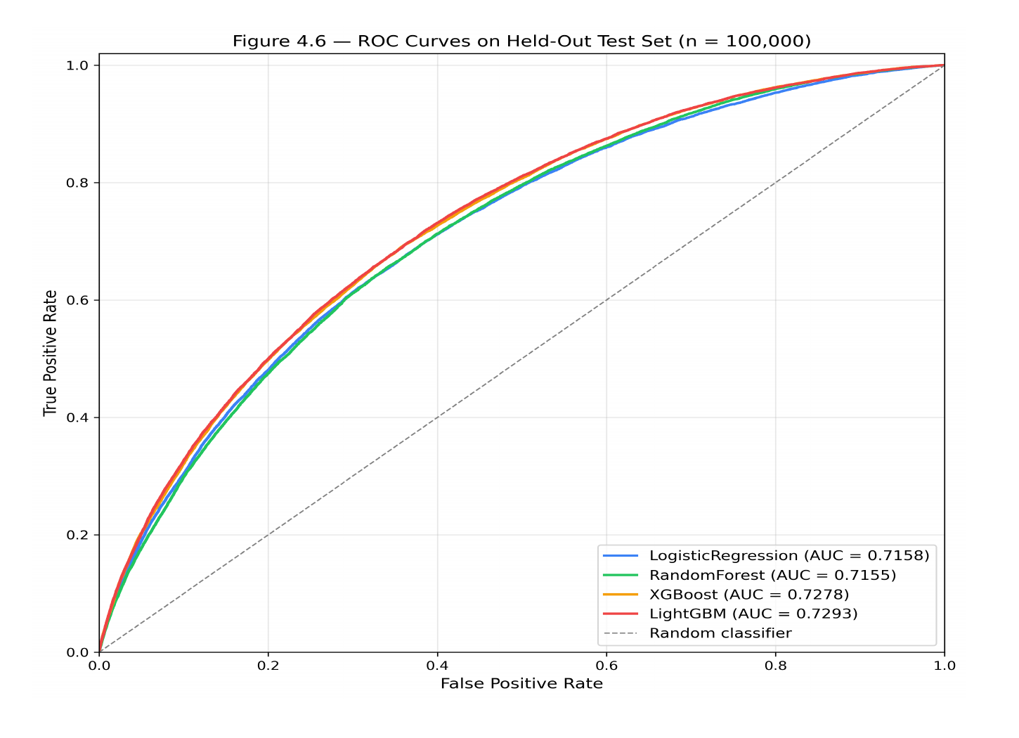
Gradient boosting (LightGBM AUC-ROC 0.7293, XGBoost 0.7278) beat logistic regression (0.7158) by a statistically significant but modest margin. That margin is deliberately honest: I removed 50 features that leak information from after a loan originates, which is what lets other published analyses of this same dataset report inflated AUCs of 0.85 to 0.90. The 0.73 figure is the ceiling for predicting default at the moment someone actually applies. Random Forest, evaluated with reasonable default hyperparameters rather than the same tuning budget as the gradient boosters, came out essentially tied with logistic regression; whether a fully tuned Random Forest would close that gap is a question this thesis leaves open, not one it answers.
What drives the model's decisions
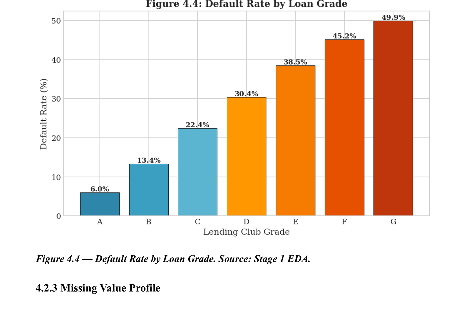
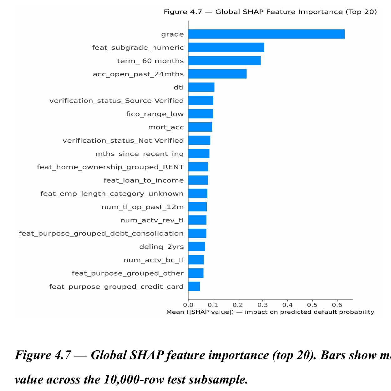
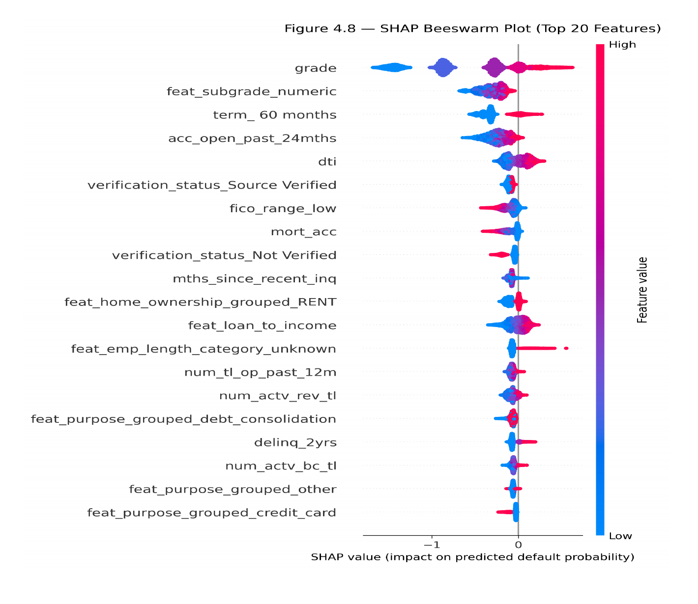
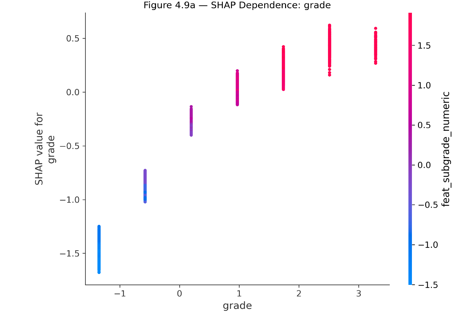
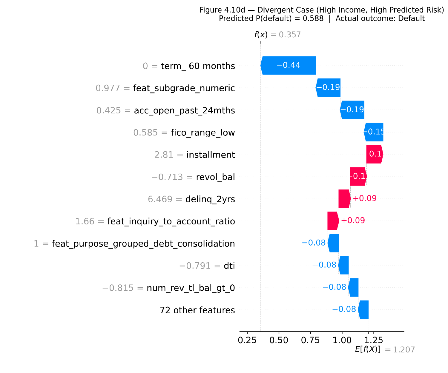
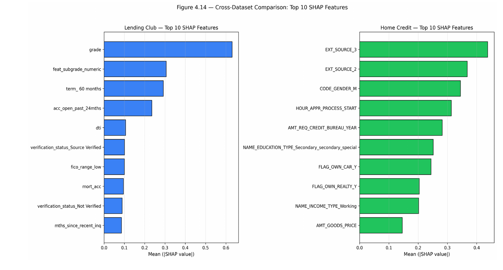
Lending Club's own assigned loan grade is the single strongest predictor by a wide margin. Behind it, seven of my engineered features made the top 20 SHAP ranking, including a numeric encoding of loan sub-grade at rank 2, but they complement the underlying bureau signal rather than replacing it. The case I find most interesting in the whole analysis is a high-income borrower who actually defaulted: a grade-and-income heuristic would have read them as low risk, but the SHAP breakdown surfaced the real signal underneath, a high installment-to-income ratio, heavy revolving-credit utilisation, and a recent delinquency flag. That is the actual argument for explainable ML in credit scoring: not that it is more accurate in the abstract, but that it can catch risk a simpler heuristic misses, and show its work while doing it.
Is it fair?
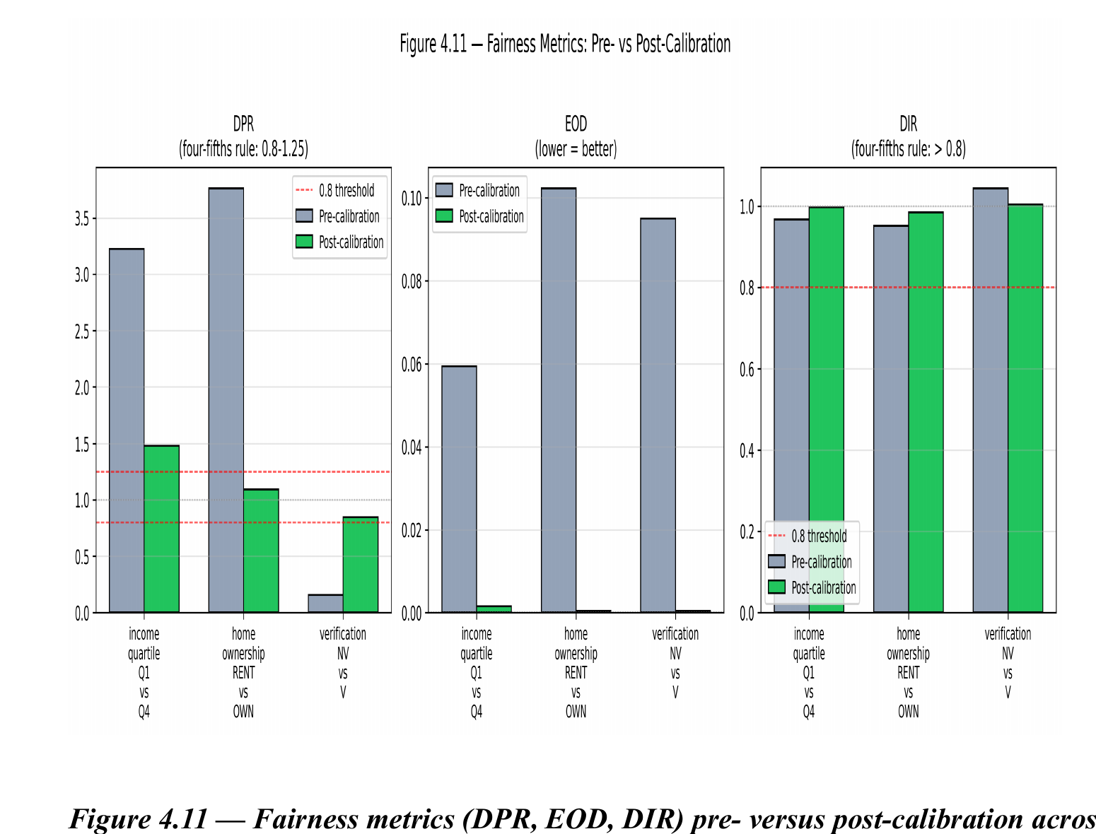
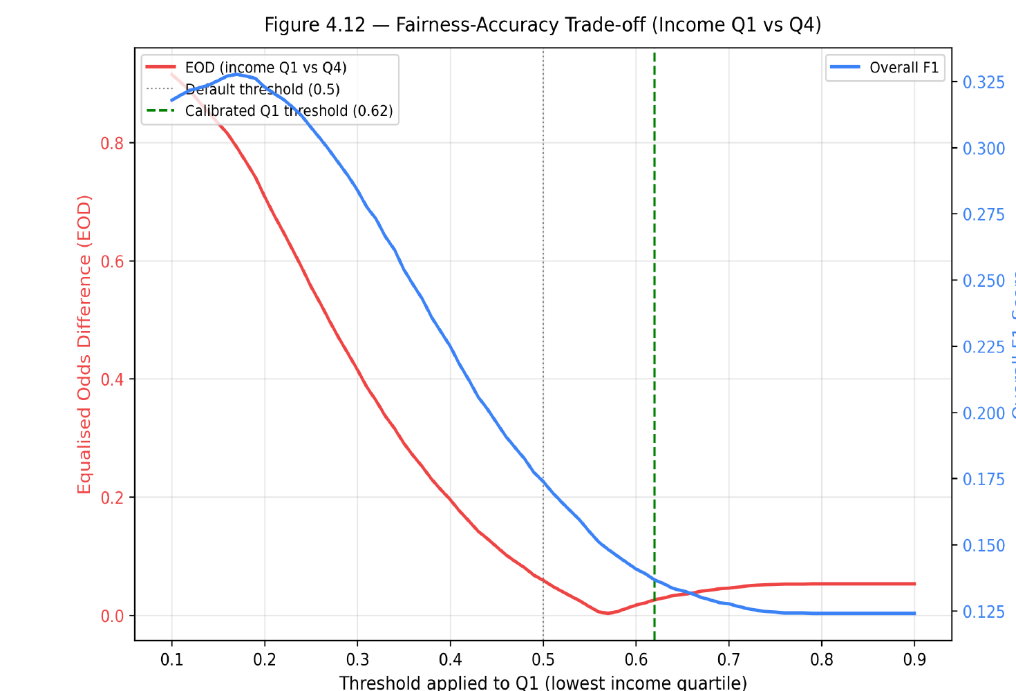
Before any correction, all three subgroup comparisons failed the four-fifths fairness rule. Low-income borrowers were predicted to default at roughly 3.2 times the rate of the highest-income quartile; renters at roughly 3.8 times the rate of owners. Group-specific threshold calibration, tuned per subgroup pair rather than applying one global threshold, cut the fairness gap (Equalised Odds Difference) by 97 to 99 percent across all three comparisons. The home-ownership calibration did this while also more than doubling the model's F1 score, fairness and accuracy moved in the same direction, because the uncalibrated model's default threshold of 0.5 was never a good operating point to begin with on this imbalanced data.
Does it hold up on a different dataset?
I replicated the full pipeline on Home Credit Default Risk, a dataset from a different lender serving different markets (307,511 applications, an 8 percent default rate versus Lending Club's 20 percent, and an entirely different feature taxonomy), using the exact hyperparameters tuned on Lending Club, with no re-tuning. AUC-ROC held: 0.7532, actually slightly higher than on Lending Club. Not one SHAP feature name overlapped between the two datasets, because they don't share column names, but the pattern was identical: both models leaned hardest on externally-sourced credit-bureau-style scores as their top predictors. The architecture transfers to a structurally different lending context without modification.
What this doesn't show yet
Every applicant in both datasets already has a formal credit-bureau footprint. That means this thesis validates that the EICS Framework works: it predicts, explains, and can be audited and calibrated for fairness. It does not yet validate the financial-inclusion claim that motivated the project, because the data available doesn't include the thin-file and no-file population that claim is actually about. The framework is the bridge; walking across it, testing it against a population it was built to eventually serve, is the next study, done in partnership with an institution that actually lends into that population.
FIGURES
The findings, in pictures
A curated set of figures from the thesis, captioned in plain language. The full figure set, methodology, and appendices are in the PDF above.